Following are my personal comments on specific markets and issues. I chart markets for a hobby and my comments are the result. They are not recommendations to buy or sell anything and should not be thought of as such. They are for entertainment purposes only so enjoy.
Please remember, the following is pure speculation based only on my experience and chart patterns. "Every sunken ship has a room full of charts."
David Bruce Edwards
July 26, 2026
Note - I got a new, wider screen monitor and when I look at this web site with the screen size in full, the site spacing does not come out properly. By making the window less wide all of the text and graphics slide into place. Perhaps you are having the same experience. DBE.
As usual, I will show pictures and graphs found on Zerohedge.com, Sentimentrader.com, which include the Seasonality charts and charts made on Barchart.com. I will also mention "cycle low timing bands" suggested by another market website to which I subscribe, Cyclesman.com.
Precious Metals this Week
We all want to buy low and sell high, but what tells us when we are at a low point or near price levels where the downside risk is less than usual? Here is what I am looking at this weekend.
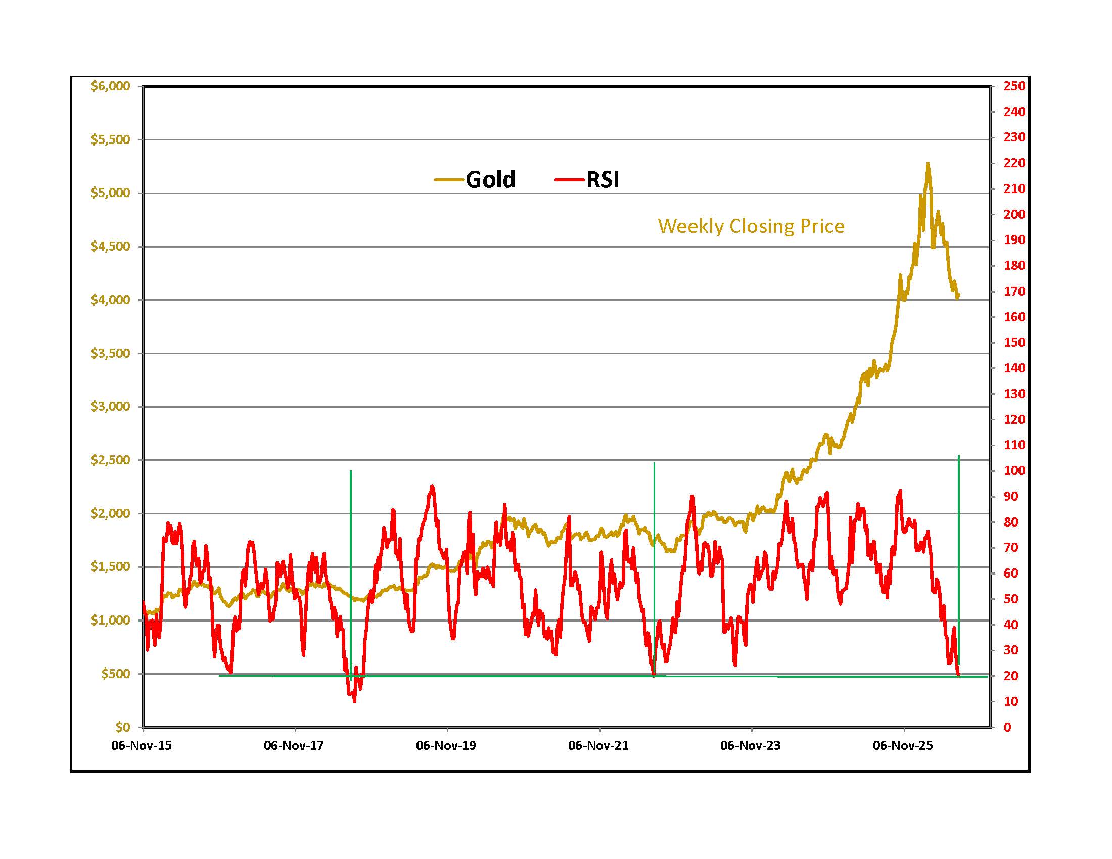
To the right is a graph of the weekly closing price of gold in NY with a simple RSI momentum oscillator below in red. RSI stands for Relative Strength Index. The oscillator shows the current closing price relative to a range of the past 14 closing prices. There is nothing magic about RSI. It is a simple way of letting traders know that the market sold off quickly and persistently over the last few months.
The horizontal green line sits at 0.20, a level that is thought of as "over sold." Things that are over sold can get even more over sold so a low RSI reading on a weekly graph is not a guaranteed buy signal. Over the last 11 years, the RSI reading fell to 0.20 only three times and each instance was not that far from a good buying point for gold investors.
Let's look at daily graphs starting at the date of the low RSI reading and continuing for 60 trading sessions.
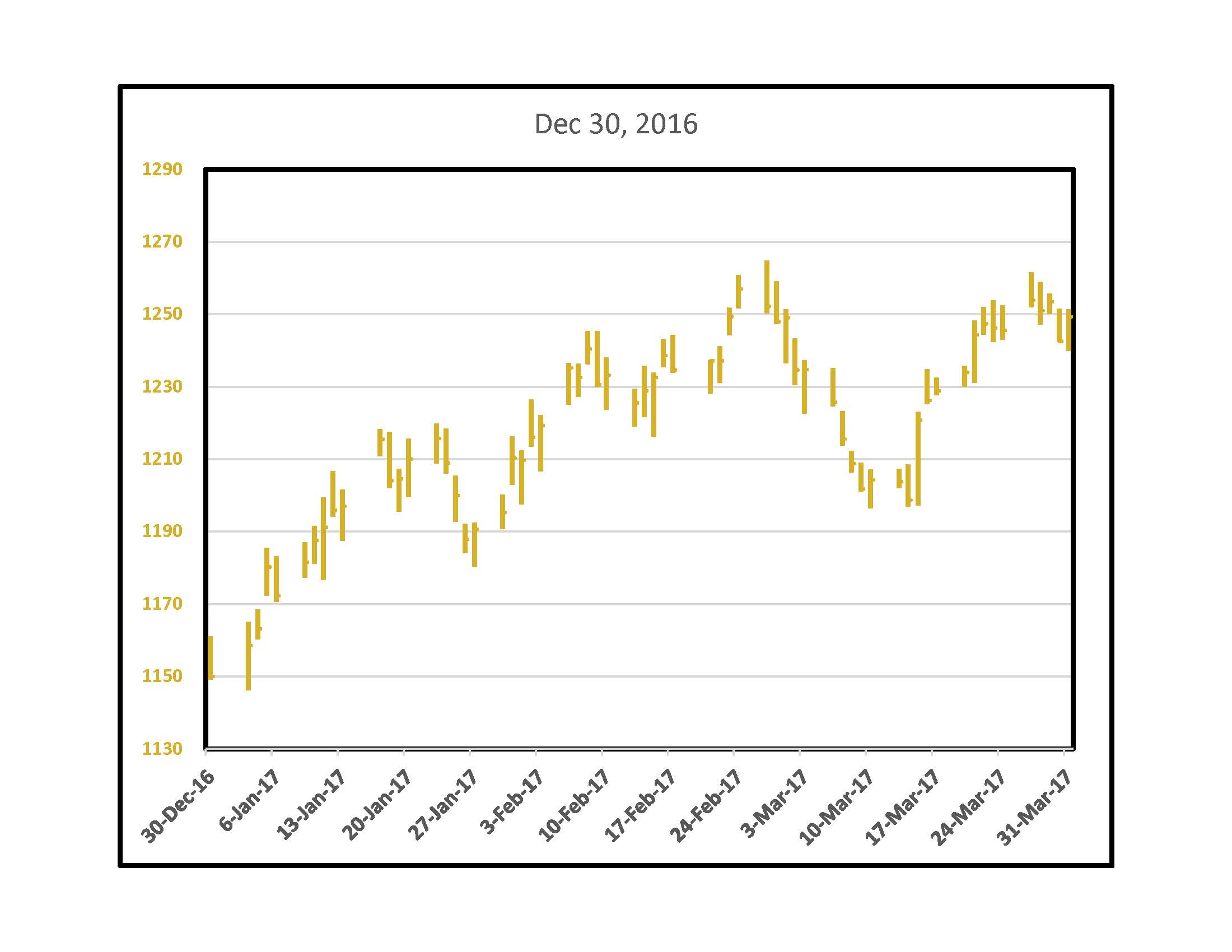
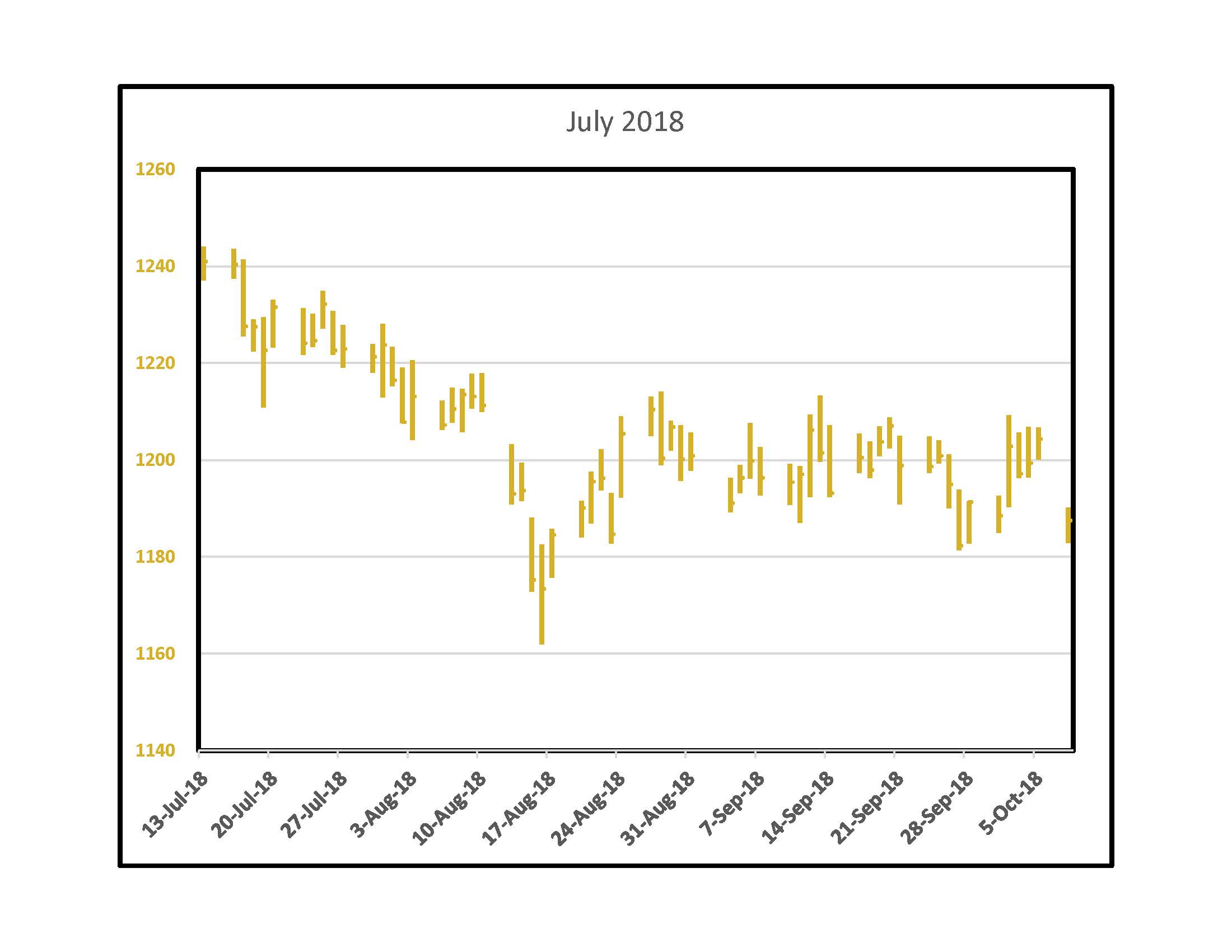
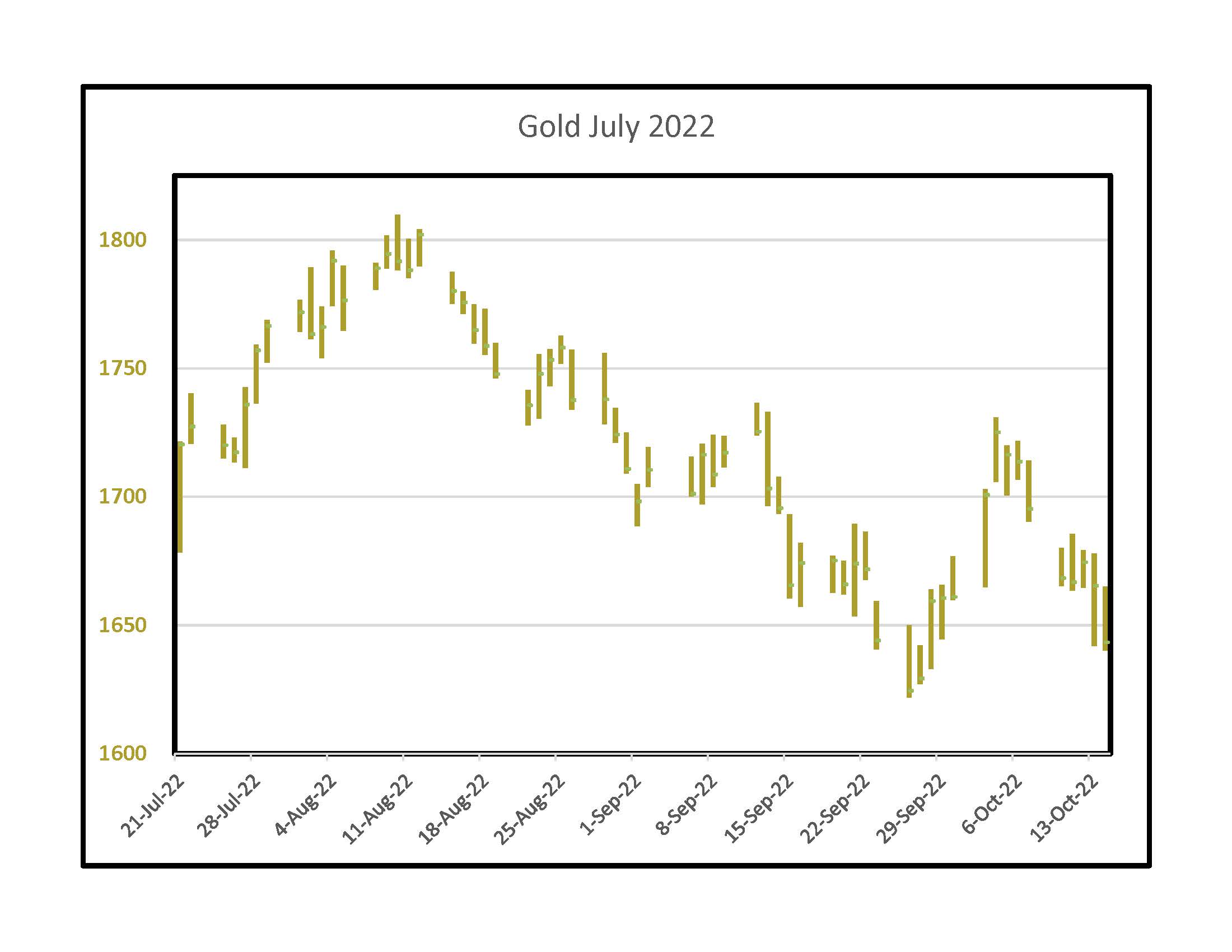
For short-term traders, the December 2016 date worked out the best. In 2018, gold bottomed a month later. In July of 2022 gold rallied a bit then continued to fall into September 26, however the RSI inflection point came with gold closing the week at $1,720 and the September low was $1,622 on a Monday. On Friday of that week it closed at $1,659 and traded above $1,700 the following week.
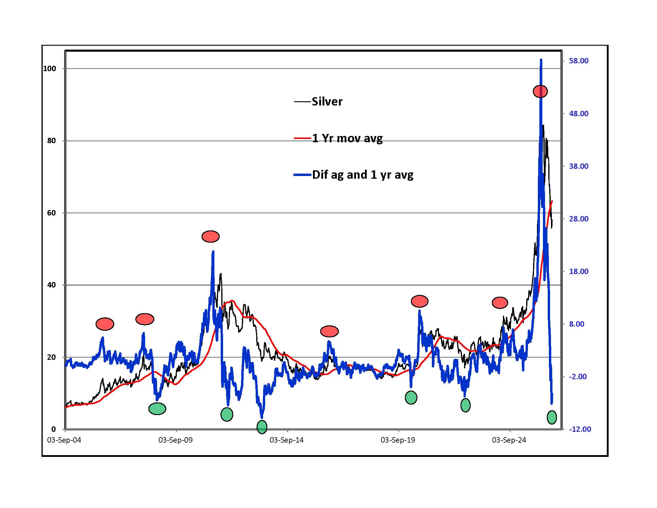
The low RSI dates on gold did not work for silver. I look at a very simple graph that compares the current weekly closing silver price to its one year moving average. Green dots mark previous low inflection points. As with gold, some green dots were at price lows and others came after an intense sell off with the bottom in the future.
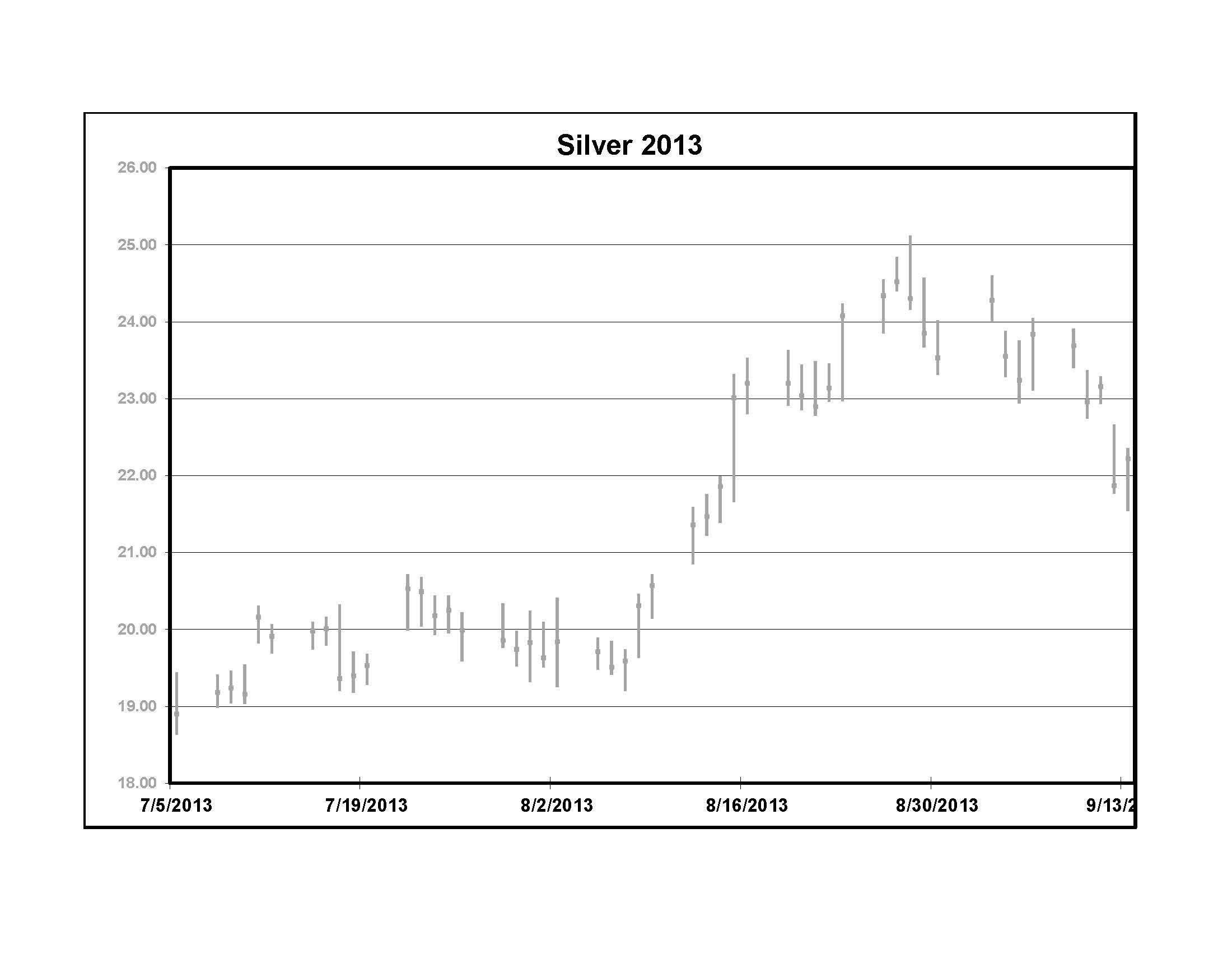
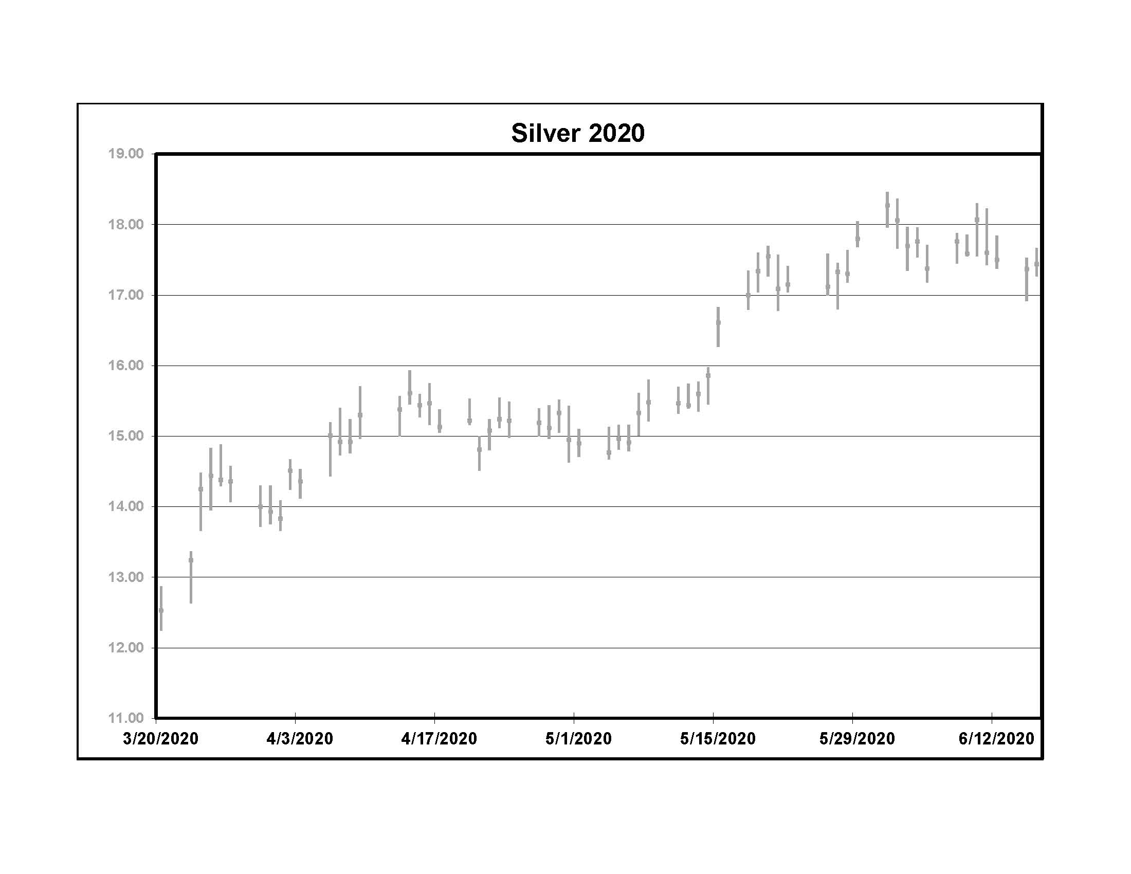
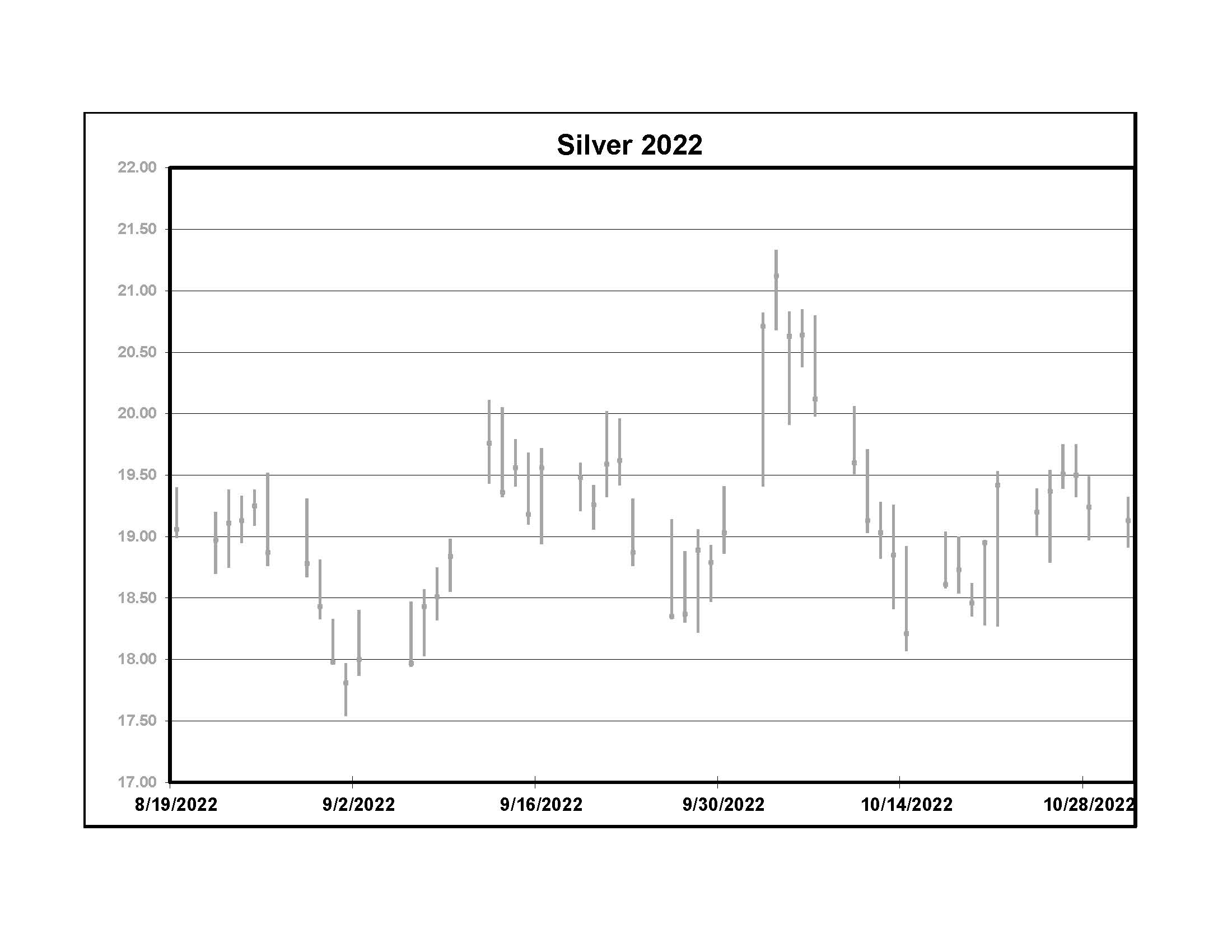
Here are daily bar charts of spot silver prices following the last three green dot weeks. Silver rallied after all of them but gave most of the gains back in 2022 before heading higher.
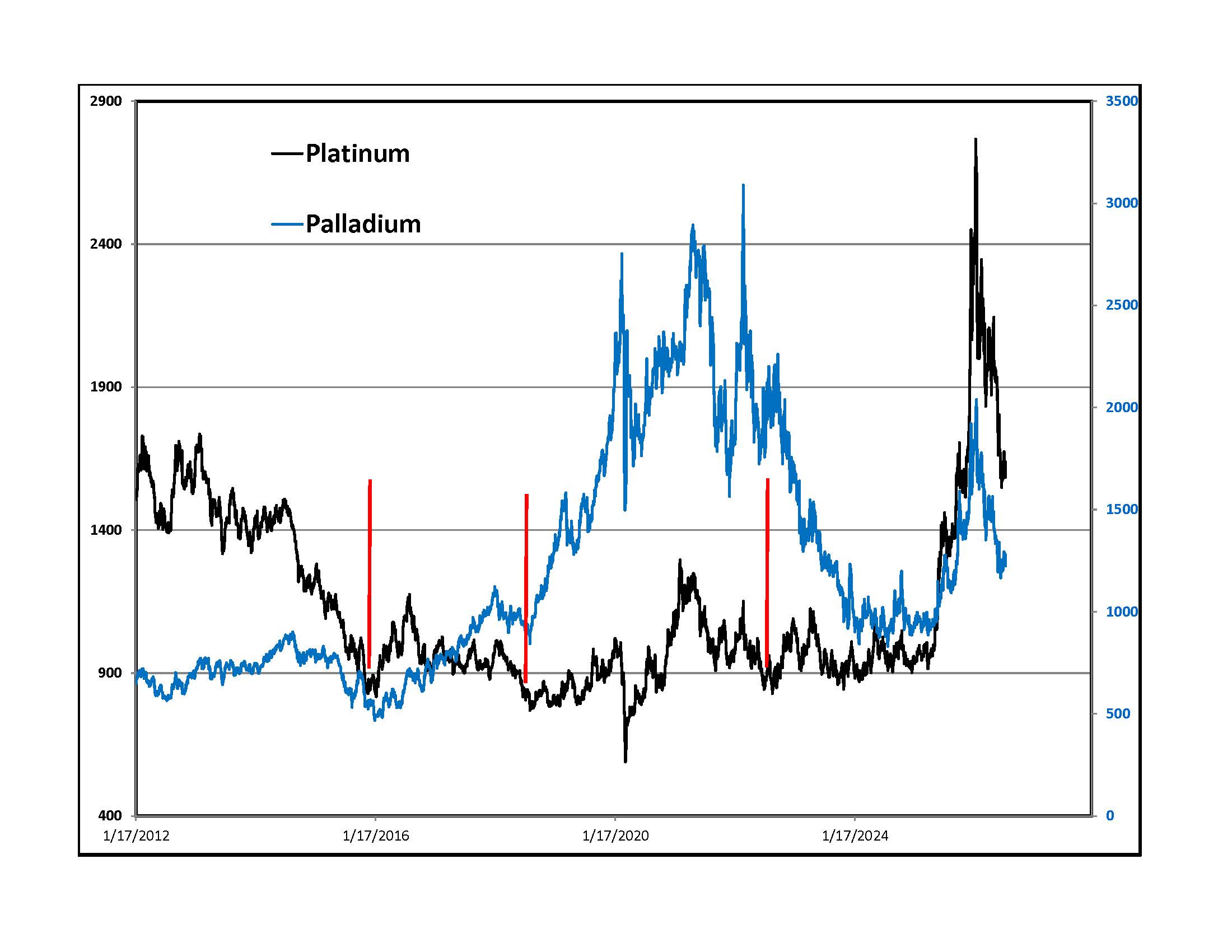
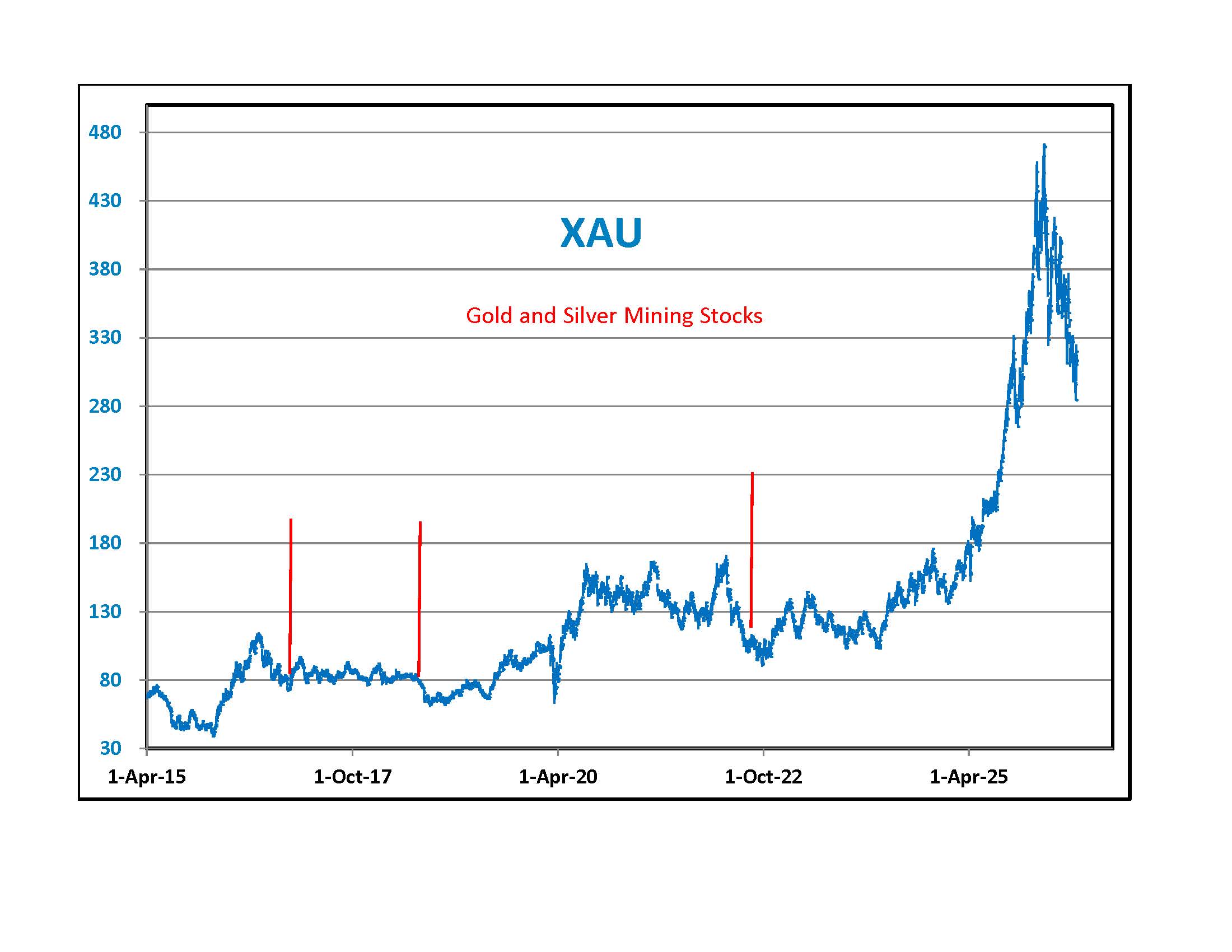
Platinum and Palladium didn't always rally after an over sold RSI reading on gold. Mining stocks did not do as well as the metal. It could be different this time around because investors are more attuned to the precious metals markets after last year's rally.
Conclusion - The weekly Gold with RSI graph and the weekly Silver with One Year Moving Average Difference chart are both at levels that gave investors a lower than normal entry point in past cycles. This does not mean that it will work out the same this year.
Best of luck,
DBE